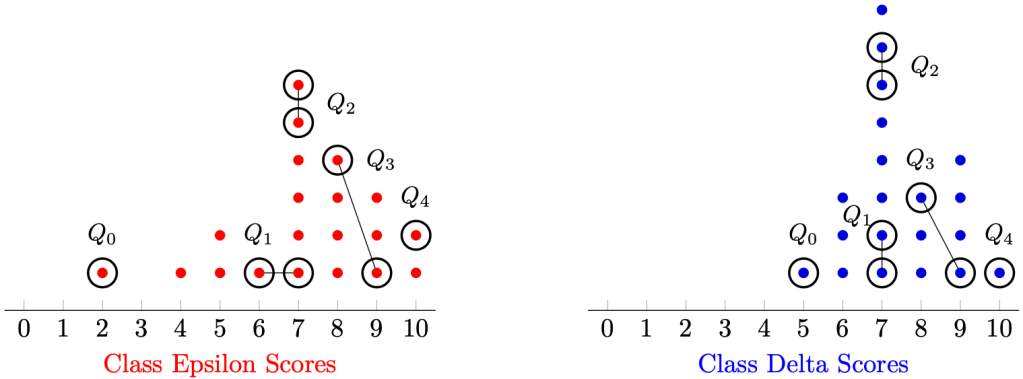
In the mock data below, the scores of a class test (total score: 10) for two classes, each with 20 students, are plotted in the dot diagram below.
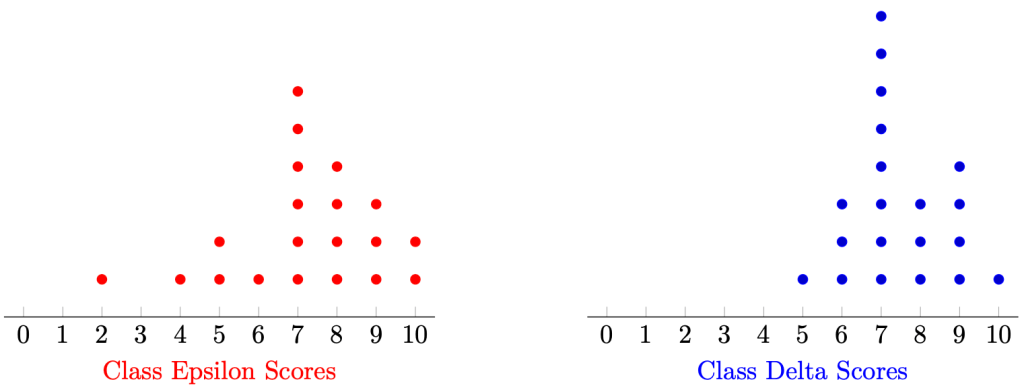
Which of the two classes did better?
This question is vague. What do we mean by “better”? We would usually like to make this decision according to some summarised data (i.e. statistics). Previously, we have learned that the most computationally convenient statistic to describe the centre of the data is the mean, given by the formula

Running the calculations, Class Epsilon has mean 7.15 and Class Delta has mean 7.45.
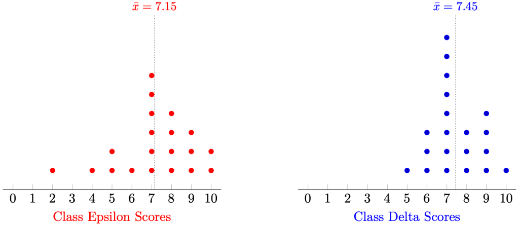
Using the mean as our measurement of aura, we might conclude that Class Epsilon is stronger than Class Delta in the exam.
But you can—and should—object: Class Delta has not just one, but two students who scored full marks! Furthermore, we notice that it seems like Class Delta’s mean score is lowered due to some poor-performing outliers. That is, Class Delta has a larger spread of data when compared to the data of Class Epsilon.
The tool that statisticians use is called the standard deviation. The intuitive idea is that we want to find the average of the deviations of the data points from the sample mean. To ensure that this calculation is mathematically convenient, we square these deviations.
Definition 1. For each data point 


Remark 1. This squared-deviation idea is responsible for linear regression—a fundamental algorithm in modern machine learning.
Theorem 1. The formula to compute the standard deviation 

Proof. Denote the data set by 

By definition, 

Dividing by 

Taking square roots,

Remark 2. If we had a collection of paired data 


Observe that 
Example 1. Using the standard deviation as the measure of spread, Class Epsilon has a standard deviation of approximately 2.01 and Class Delta has a standard deviation of approximately 1.28.
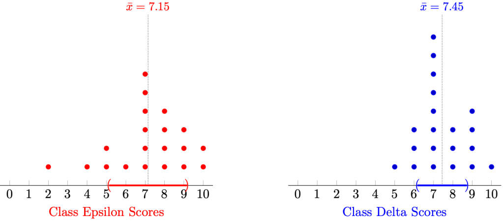
Since the latter is larger, Class Epsilon has a larger spread of scores than Class Delta.
In layperson’s terms, the scores of students in Class Epsilon are more “bunched” together, and thus we can say that the students in Class Epsilon perform more consistently than the students in Class Delta.
However, we should object to this conclusion once again: why did we use the mean and the standard deviation? These statistics are sensitive to outlier data, be it exceedingly high-performing students or exceedingly low-performing students. Why not use the median?
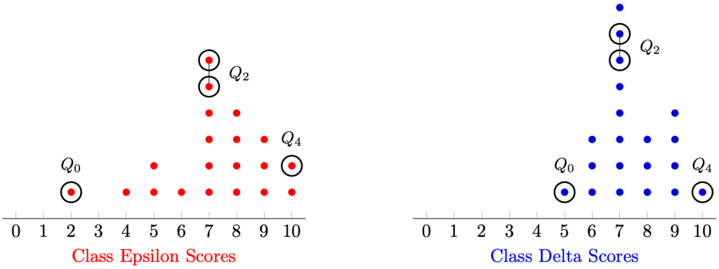
We can, and should: in this case, Class Epsilon has a median score of 7 and Class Delta has a median score of 7. Not helpful. How would we measure the spread of the data?
Definition 2. Sort the dataset into a non-decreasing order

Denote the:
- minimum by
- the median by
,
- the maximum by
,

Define the range of the data set by 
Obviously, 


If 
Remark 3. The latter Q denotes the word ‘quartile’. Therefore, the minimum can be thought of as the “zeroth” quartile, the median as the second quartile, and the maximum as the fourth quartile.
Example 2. The range in Class Epsilon is 8 and the range in Class Delta is 5. Therefore, there is larger spread in Class Epsilon than Class Delta.
But you should, once again, object to this conclusion. This measure of spread accounts for the vast outliers! Can we obtain a measure of spread that disregards outliers, just like how the median disregards outliers?
Definition 3. Suppose a data set 
- the lower quartile
by the median of the data set
,
- the upper quartile
by the median of the data set
,
- the interquartile range by
.
Question 1. How would you define the interquartile range if
Example 3. By definition,
- Class Epsilon has a lower quartile of 6.5 and upper quartile of 8.5, and hence, an interquartile range of 2.
- Class Delta has a lower quartile of 7 and upper quartile of 8.5, and hence, an interquartile range of 1.5.
Since the former is larger than the latter, we conclude that there is larger spread in Class Epsilon than Class Delta.
We can visualise the ordered information using box-and-whisker diagrams. The endpoints denote the minimum and maximum, the box denotes the interquartile range, and the centre line denotes the median. We can plot both box-and-whisker diagrams below.
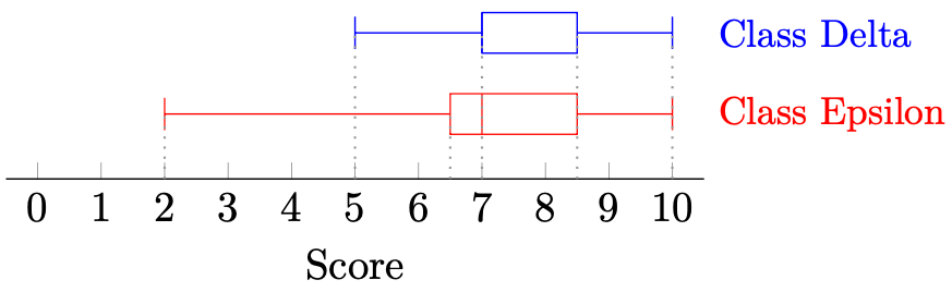
Therefore, the box-and-whisker diagram helps us visualise the data in a sufficiently meaningful manner. The distinct vertical lines denote 
Remark 4. For Class Delta, 
I have one more idea to discuss—large data sets. So far, our class sizes are small, just 20 sample points. However, if we consider all of the students in the school, we would need to deal with large data sets, say 1000. Suppose also the total score of the assessment is 100, rather than 10. How do we interpret such data? We can use a cumulative frequency diagram.
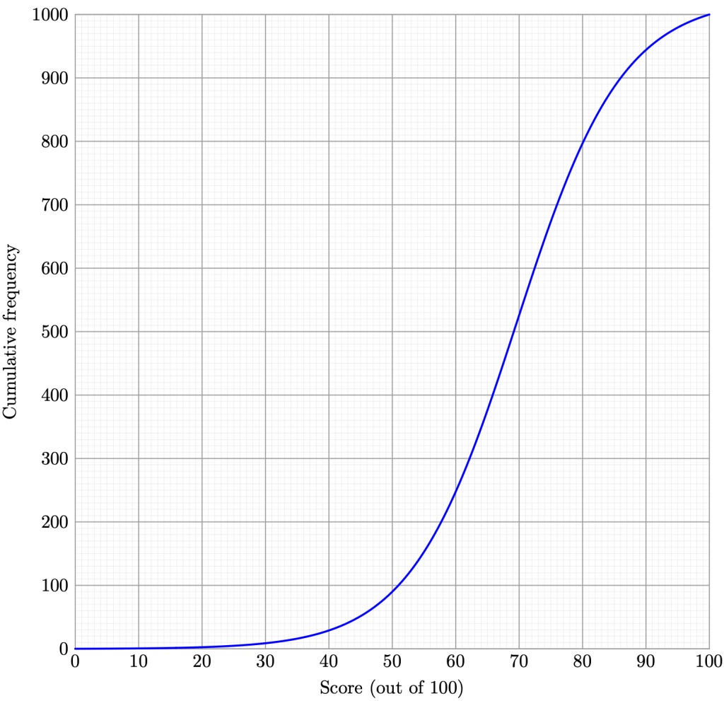
The 


Remark 5. Cumulative frequency diagrams, being discrete, tend to be more jagged than what we see displayed. Nevertheless, this smooth approximation turns out to be mostly accurate relative to our original data.
Example 4. Estimate the median, range, and interquartile range of the data. Use your estimates to represent the data using a box-and-whisker diagram.
Solution. It is clear that 


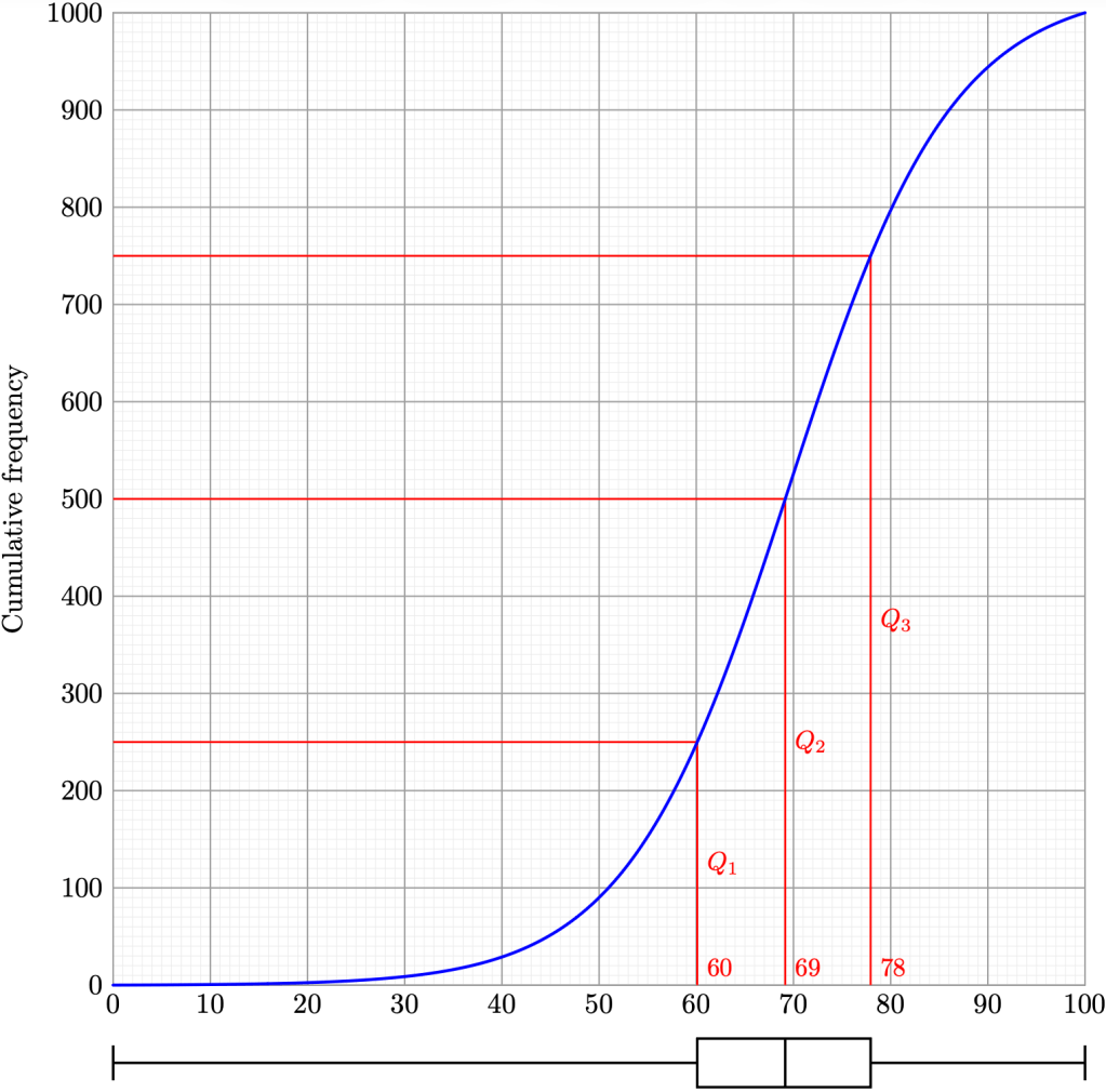
Therefore, we estimate the median to be 69 marks, and the interquartile range to be 18 marks.
Example 5. Using intervals of 10 marks each, estimate the mean and the standard deviation of the data.
Solution. We leave it as an exercise to tabulate the following summarised data.
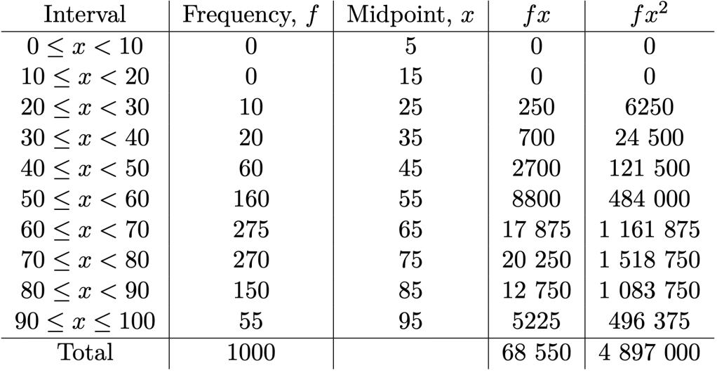
In particular,

Therefore, we estimate the mean of the data to be

and by Theorem 1, the standard deviation of the data to be

Remark 6. In the era of Microsoft Excel and Python, software can compute means and standard deviations of large datasets without using the grouped data approach. They can handle millions of computations—we can’t.
Would you still object? In the spirit of inquiry and scepticism, why not? However, I think my job here is done—I have introduced the key calculations required in secondary school statistics!
Just for fun, for those of you curious about quantitative finance, where you use mathematics and statistics to possibly win the stock market or even the cryptocurrency market. Individuals working in these fields, called quants, use the Sharpe ratio, defined by 

Finally, for Singaporeans who (or whose parents) remember the notion of a t-score in the high-stakes Primary School Leaving Examinations (PSLE), the student’s final score for a particular subject is computed using the formula

and these numbers are summed over the four subjects: English, Mother Tongue, Mathematics, and Science. My PSLE score was 242—make of that as you will. Contrary to popular expectation, I did *not* get A* for Mathematics due to less-than-academically-important reasons.
All of these statistical analyses arise from random phenomenon, and are general grasps of otherwise un-graspable realities. But can we at least quantify such uncertainty? Our attempt at doing so is probability theory, and we will visit this idea briefly the next time.
—Joel Kindiak, 18 Mar 26, 1435H

Leave a comment